PMI Adoption index overview
What is the purpose of PMI adoption index?
PMI adoption index is designed to answer the question: How effectively is my property/department using PMI to optimally manage resources and increase the likelihood of a higher GOP?
The index dashboard can be used as a learning and development tool for department heads to help improve their skills and adopt best practices around productivity and resource management.
A score of 8 out of 10 or higher indicates the property/department is following PMI best practices and can reap the benefits from working with PMI.
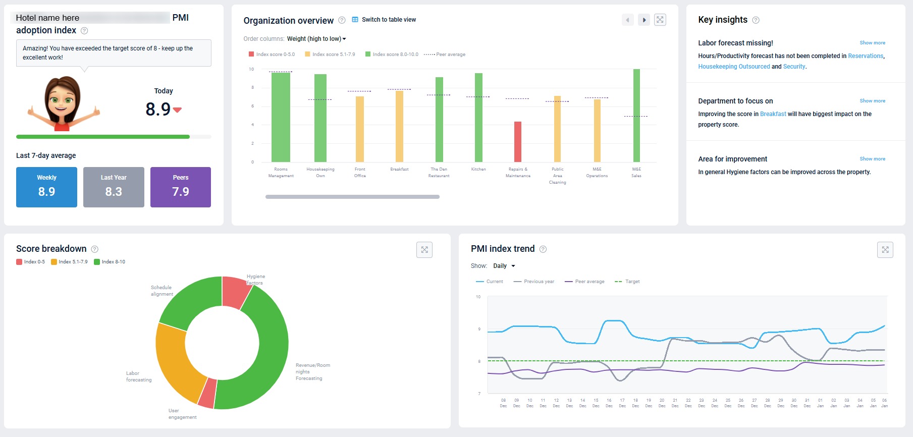
Image description: The Adoption index page in PMI with property view
How is the score calculated?
It is an aggregated score based on the individual tasks that make up productivity management in PMI. Each task has a different impact, or weighting,on the total score depending on its importance.
The weighting varies based on the department’s classification:
-
- Cockpit only: The weight is calculated based on how many hours the department uses out of all hours used at the hotel. Examples of a labor cockpit are Front Office, Housekeeping, Public Area cleaning, Administration, Maintenance, Kitchen, and Stewarding.
- Profit Center only: The weight is calculated based on what revenue share of total revenue this profit center has. An example of a profit center is the department Other.
- The weight is a mix of the two calculations above. Examples of a combined labor cockpit and profit center are Restaurant, Bar, Breakfast, and Meeting & Events.
The score is calculated at department, property, group and chain level.
-
- The department index is calculated by combining the score and weight of each relevant measurement for that department
- The property index is an accumulated score of all departments. Each department has a different weighting depending on the size of that specific department. The department size is determined by revenue and hours worked in the last 7 weeks. A larger department will have a bigger impact on the total score.
- The group score is an accumulated score of all properties within the group. Each property has a different weighting depending on the revenue and hours worked in the last 7 weeks. <
- The chain score is an accumulated score of all groups within the chain. Again, the groups weighting is determined by the revenue generated and hours worked.
The score is recalculated daily, shortly after midnight CET, so if you make changes in PMI be sure to check back the following day to see the effect on your score.
How to access the dashboard
Access the adoption index from the tile on the home screen, or the main menu.
Property level view
The property level view is the default view. This overview of the property is ideal for a GM or management. It displays the performance of each department and highlights what areas are bringing the property score down.
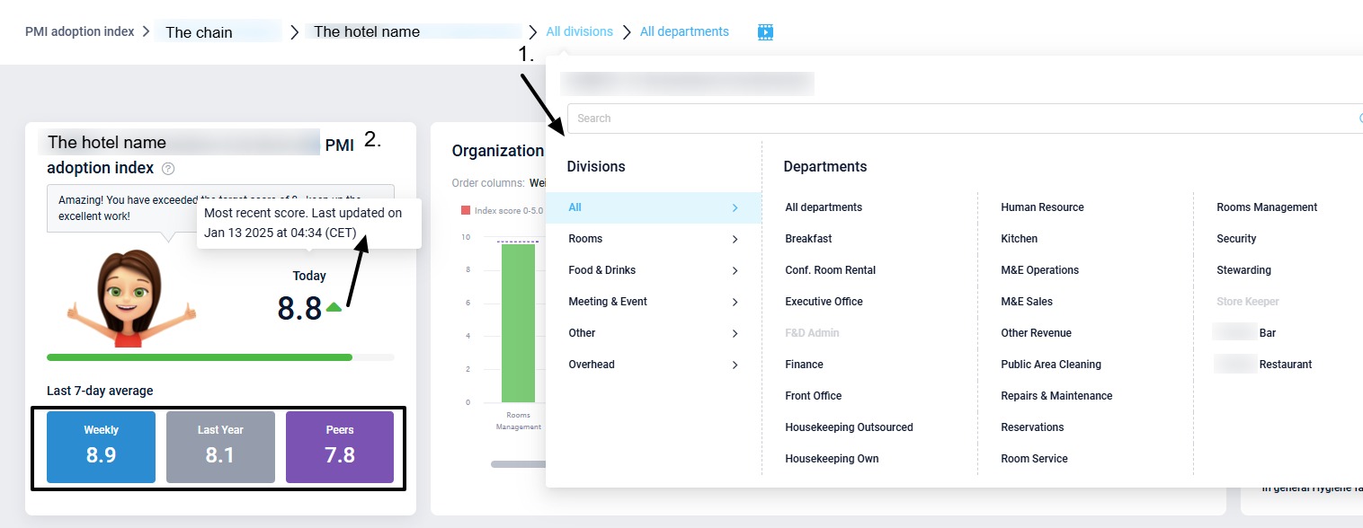
1. Navigation
Use the navigation buttons to switch to a specific department. Subject to access rights, you can also view a different property, group, or chain view.
2. Score tile
The first tile shows the scores of the property. Hover over ‘Today’ score to see when the value was last updated.
-
- Today – the most recent calculated Index score.
- The arrows indicates how your score compares to the previous day. Hover over the score to view when this was last updated.
- Weekly – the average score from the last 7 days.
- Last Year – The Weekly PMI score for the same period last year.
- Peers – The average Weekly PMI score for the properties in your peer group. Hover over the button to see who your peers are considered to be.
- Today – the most recent calculated Index score.
3. Organization overview
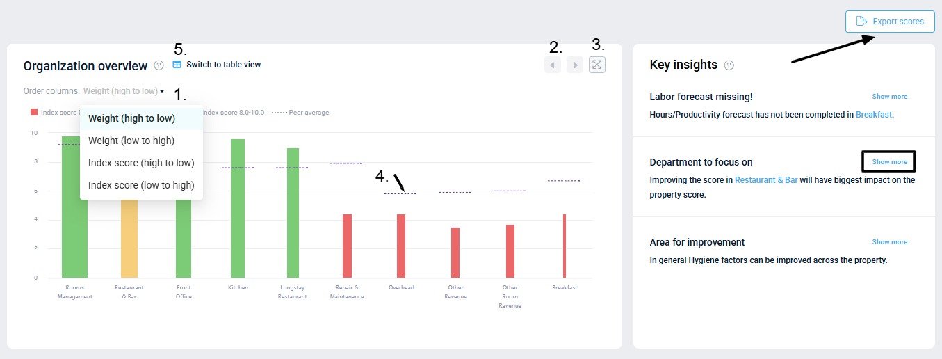
This graph shows all department scores in a property. The color and height of a bar indicate the index score. The width of the bar indicates the weighting, or the impact on the overall score. The width indicates how much revenue is generated and how many hours are used by that department. Departments with the most revenue and hours have the widest bars. Click on a bar to view the department’s index dashboard.
1. Sort by weighting: Use the toggle to sort the order by weight or by index score.
2. Scroll arrows – Use these to view additional departments on the graph if there are too many for one view.
3. Expand icon – Click to expand the graph to full size.
4. Peer average: The dotted lines on the graph show the peer average. When a property is part of a group/country, the peer average is based on the group or country it belongs to. When there is only one property in a group, the peer average is calculated based on the next level up, i.e. country. If there is only one property in the country, then the peer average is based on the chain it belongs to.
5. Table view – Click to view all departments in a table. Click on a header to sort the table in the order needed.
4. Key insights
Suggestions and recommendations of what to prioritise will be listed here, based on the scores of the properties. These recommendations are updated daily, along with the property index scores.
5. Export scores
Click the button to export historical scores. Select a date range and the type of scores needed. To export group or chain scores, you need to view at chain level.
6. Score breakdown
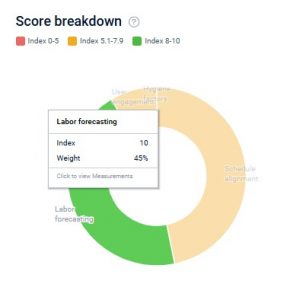
The donut chart breaks the score down into 5 key section. The purpose of the graph is to highlight which area can be improved.
- Hover over a section to see the index score and weighting.
- Click on a section to view the departments that make up that section.
- Click on a department to view the index dashboard page.
7. Index trend graph
This graph shows the property’s adoption index score trend. Use this to look back and evaluate how the index score has changed over time.
- Choose Monthly or Daily view.
- Hover over the lines on the day or month you wish to view to see more details.
- Click the expand button to view the graph in full size.
Department view
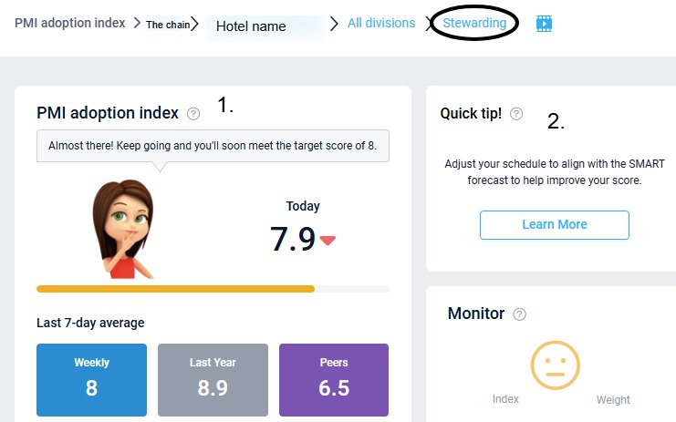
1. Score tile: This highlights the department score.
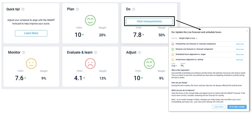
2. Quick tip: Highlights actions that can be taken today which will have the biggest impact on the index score. Select ‘Learn more’ for an explanation of the task required and click the link to view the relevant module in PMI.
ARM tiles:
The individual tasks and skills being measured are organized according to Adaptive resource management (ARM) process framework which consists of 5 steps: Plan, Do, Monitor, Learn and Adjust.
The smiley face indicates the score:
- Red – score below 5.
- Amber – score between 5.1 and 7.9,
- Green – score of 8 or above.
The weight shows the sections’ percentage of the total department score. A higher weighted section will have a greater impact on the total score.
To view the measurements included in each step, click on the relevant tile. Click ‘Show more’ for a full explanation on why this is important, how you are doing and what is needed to improve. Click the link to review the relevant page in PMI and adjust as needed.
Index trend graphs: Shows the departments index development over time.
Group view and chain view
These views are useful for head office /regional manager / cluster managers who are looking for a higher level overview of their properties.
Access these views via the top navigation bar. They show the same detail as department view, except break it down to properties within group / chain instead of departments.
-
Getting started
-
-
- Arrivals/Departures
- Data elements required from PMS
- Manual Export PMS – Fidelio
- How to do a manual PMS export from Opera
- Manual Export PMS – Picasso
- Manual Export PMS – Protel
- Manual Export PMS – Spirit Web
- PMS – Cenium
- PMS – Citybreak
- PMS – Fidelio
- PMS – Opera
- PMS – Protel
- How to do a manual PMS export from HotSoft
- PMS – Skidata
- How to set up an Opera reports export
- PMI API
- PMI API Best Practice Get Forecasted hours
- PMI File Agent setup and documentation
- Technical specification for data integration
- How to transfer data to PMI
- How to enable Opera Cloud reports
- PMI system integration overview
- Import status overview
- Handling Outstanding Imports (Missing Data) in PMI
- How to read the import status page
- Opera Scheduler setup - Reservation Statistics 1
- Opera Scheduler setup - Report Trial Balance (trial_balance)
- Opera Scheduler setup - Reservation Forecast, (res_forecast)
- Opera Scheduler setup - Reservation History & Forecast (history_forecast)
- Opera Scheduler setup - Daily Forecast Report
- Opera Scheduler setup - SFTP transfer guide
- Manual Export PMS Opera
- Report 1 (manual export): Reservation Statistics 1 (res_statistics1)
- Report 2 (manual export): Reservation Forecast, (res_forecast)
- Report 3 (manual export): Trial Balance (trial_balance)
- Report 4 (manual export): Reservation History & Forecast (history_forecast)
- Show all articles ( 7 ) Collapse Articles
-
- Understanding Productivity in Hospitality (and Why It Matters in PMI)
- How Forecasting Drives Productivity in Hotels
- The Most Important Productivity KPIs in Hospitality
- The Hotel Productivity Management Cycle
- Hospitality Productivity and PMI – Quick overview
- Balancing Productivity, Cost Control, and Guest Service in Hotels
-
Video tutorials
-
- Administration Labor cockpit [14:49]
- Bar and Pub Labor cockpit [12:21]
- Breakfast Labor cockpit [12:05]
- Consolidated view in Benchmarking and Management Perspective [3:20]
- Flash Report Onboarding [6:27]
- Flash report overview [2:25]
- Food cost cockpit [6:21]
- Kitchen Labor cockpit [11:28]
- Labor Cockpit Onboarding [18:16]
- Labor cockpit overview [3:12]
- Live forecast 1/5 navigation [5:05]
- Live Forecast 2/5 Rooms [5:05]
- Live forecast 3/5 meeting & event [5:40]
- Live forecast 4/5 food & beverage [6:11]
- Live forecast 5/5 breakfast [7:19]
- Live forecast onboarding [6:06]
- Live forecast overview [2:58]
- Management perspective overview [3:06]
- P&L Planning 1/10 Purpose and benefits [2:25]
- P&L Planning 10/10 How to approve forecast and budget or target [2:34]
- P&L Planning 2/10 Navigation [4:26]
- P&L Planning 3/10 How to build a total [4:29]
- P&L Planning 4/10 Three ways of inserting figures [4:32]
- P&L Planning 5/10 How to add a sub account [1:42]
- P&L Planning 6/10 How to build a constant [2:42]
- P&L Planning 7/10 Staff module [2:48]
- P&L Planning 8/10 How to add a staff member [1:33]
- P&L Planning 9/10 How to revise and submit a forecast [3:01]
- Repair and Maintenance Labor cockpit [13:01]
- Restaurant Labor cockpit [12:30]
- Schedule 1/8 Navigation [5:12]
- Schedule 2/8 How to create a labor cockpit schedule [4:29]
- Schedule 3/8 How to add a team member [2:07]
- Schedule 4/8 How to create a shift code [3:30]
- Schedule 5/8 How to add shift codes to team members [3:41]
- Schedule 6/8 How to create a rotating schedule [3:20]
- Schedule 7/8 How to replace shift codes for a period [2:00]
- Schedule 8/8 How to create split shifts between departments [2:42]
- Stewarding Labor cockpit [11:38]
- Timesheet Onboarding [4:14]
- Show all articles ( 25 ) Collapse Articles
-
- Articles coming soon
-
- Administration Labor cockpit [14:49]
- Bar and Pub Labor cockpit [12:21]
- Breakfast Labor cockpit [12:05]
- Food cost cockpit [6:21]
- Front office Labor cockpit [12:05]
- Housekeeping Labor cockpit [11:20]
- Kitchen Labor cockpit [11:28]
- Labor Cockpit Onboarding [18:16]
- Labor cockpit overview [3:12]
- Repair and Maintenance Labor cockpit [13:01]
- Restaurant Labor cockpit [12:30]
- Schedule 1/8 Navigation [5:12]
- Schedule 2/8 How to create a labor cockpit schedule [4:29]
- Schedule 3/8 How to add a team member [2:07]
- Schedule 4/8 How to create a shift code [3:30]
- Schedule 5/8 How to add shift codes to team members [3:41]
- Schedule 6/8 How to create a rotating schedule [3:20]
- Schedule 7/8 How to replace shift codes for a period [2:00]
- Schedule 8/8 How to create split shifts between departments [2:42]
- Stewarding Labor cockpit [11:38]
- Timesheet Onboarding [4:14]
- Show all articles ( 6 ) Collapse Articles
-
- How to edit a plan [3:52]
- P&L Planning 1/10 Purpose and benefits [2:25]
- P&L Planning 10/10 How to approve forecast and budget or target [2:34]
- P&L Planning 2/10 Navigation [4:26]
- P&L Planning 3/10 How to build a total [4:29]
- P&L Planning 4/10 Three ways of inserting figures [4:32]
- P&L Planning 5/10 How to add a sub account [1:42]
- P&L Planning 6/10 How to build a constant [2:42]
- P&L Planning 7/10 Staff module [2:48]
- P&L Planning 8/10 How to add a staff member [1:33]
- P&L Planning 9/10 How to revise and submit a forecast [3:01]
-
- Articles coming soon
-
-
Onboarding
-
- Onboarding roles overview
- Onboarding roles – Breakfast
- Onboarding roles – Finance
- Onboarding roles – Food cost
- Onboarding roles – Front Office
- Onboarding roles – Housekeeping
- Onboarding roles – Kitchen
- Onboarding roles – Restaurant and Meeting & Event
- Onboarding roles – Stewarding
- Onboarding roles – Repair and Maintenance
- GM Introduction to PMI
- Onboarding roles – Bar and Pub
- Onboarding roles – Administration
-
-
GM's corner
-
PMI homepage
-
PMI planning
-
- How to work with Rooms Budget and forecast
- How to work with non-rooms Budget and forecast
- Use Forecast/Budget hours from Cockpit in P&L Staff module
- How to input a budget in PMI
- Setting productivity targets in PMI
- Express planner overview
- How to run Express planner
- How to configure Express planner settings
- Express planner calculation explanation with examples
- Compiling revenue streams overview
- How to manually enter a revenue budget in PMI
- How to enter a revenue budget in PMI using Live forecast data
- How to enter a revenue budget in PMI using the Data Upload Centre
- How to set monthly labor productivity and hour targets in PMI
- Arrivals, departures, and stay over visibility
-
- Accounts overview
- How to populate and edit accounts
- How to approve a forecast or budget in PMI
- How to copy from reference
- How to edit and update using the staffing tool
- How to make a profit forecast
- How to set up a weekly Live forecast
- How to add a comparison year in P&L
- How to modify a P&L report
- Planning Menu – Tools and View Options overview
- Planning staff module overview
- How to build a P&L planning report
- How to add staff and manage staff cost
- Staffing screen overview
- How to input a budget in PMI
- PMI Planning module overview
- How to add a Food & beverage revenue forecast in P&L Planning
- How to add room revenue in Planning
- Constants explained: how they work in PMI Planning
- Auto-populate P&L Staff hours and rates from Budget & forecast
- Profit & Loss staff – Copy hours and rates to cockpit
- Show all articles ( 6 ) Collapse Articles
-
-
Cockpit
-
- Labor cockpit overview
- Labor Cockpit Preparations
- Labor cockpit cost driver
- SMART forecast explained
- How does SMART allocate daily hours?
- Using arrivals and departures as a cost driver
- Closing Profit Center or Cockpit
- How to work with labor cost
- Min/Max explanation
- Parent and sub-cockpits explained
- Staffing guide explained
- Daily and weekly routines for department heads
- Understanding the importance of including outsourced labor hours in PMI
- How to add labor cost in PMI
- Cockpit rates - Daily weighted payroll projection
-
- Labor cockpit schedule
- How to make a schedule
- How to revise a schedule
- PMI Schedule: Information and Calculation rows explained
- Predefined shift codes
- How to print a schedule
- Revise staff
- Schedule 1/8 Navigation [5:12]
- Schedule 2/8 How to create a labor cockpit schedule [4:29]
- Schedule 3/8 How to add a team member [2:07]
- Schedule 4/8 How to create a shift code [3:30]
- Schedule 5/8 How to add shift codes to team members [3:41]
- Schedule 6/8 How to create a rotating schedule [3:20]
- Schedule 7/8 How to replace shift codes for a period [2:00]
- Schedule 8/8 How to create split shifts between departments [2:42]
- How to work with the Schedule in PMI
- Split Shifts Between Departments
- The Schedule Tools & View menu options overview
- Show all articles ( 3 ) Collapse Articles
-
-
Live forecast
- Live forecast overview
- How to set up a Live forecast: configuration settings
- Live forecast tools and personal view settings
- PMI prediction explained
- Pickup explanation
- Revenue driver explained
- Segment OTB
- Submit Live Forecast to Forecast (monthly routine)
- NextGen Rooms Live forecast overview
- NextGen Rooms Live forecast: Weekly routine overview
- Rooms live forecast: How to work with auto Live forecast
- NextGen Rooms live forecast: Personal view options
- Rooms Live forecast: Sense check mode explained
- How pickup fields are displayed and used in Room live forecast
- Collaborative Forecasting with PMI Prediction
- Non-rooms Live forecast using PMI prediction
- Live forecast – Copy to live forecast
- Live forecast – Revise forecast/budget
- Rooms Live forecast - Edit guest nights factor explained
- Show all articles ( 4 ) Collapse Articles
-
Data analysis views
-
Administration
-
- Add documents to a property
- Currency settings
- Fact sheets overview
- Group external hotel
- How to use hours transfer [3:34]
- Hours transfer rules
- Operational status
- Period locking overview
- Share group
- Share hotel
- How to complete Classification Fact sheet
- How to use Period locking for R&P in practice
- How to manage GoGreen Period locking
-
-
GoGreen
-
- Comparative data explained
- Data table general explained
- Formula/Calculations explained
- Goal charts and YoY comparison explained
- How to edit a GoGreen plan
- How to set up a Plan
- Intro to NextGen GoGreen Planning
- Main chart explained
- Plan values explained
- Save changes button explained
- Sense check mode explained
- Unit price explained
- Volume/usage/consumption explained
- How to do a monthly forecast routine in NextGen Planning
- GoGreen home page overview
- GoGreen Doing Cockpit overview
- GoGreen Learning page overview
- GoGreen index overview
- Weather normalization overview
- CO2 factors overview
- GoGreen targets explanation
- GoGreen index: How are the measurements calculated?
- Useful links for sustainability and environmental management best practice
- How to make a manual entry in a GoGreen cockpit
- Weather normalization explained
- GoGreen benchmarking enhancement - 01.23
- GoGreen – Data Integration & Insights (Overview)
- Environmental Sustainability in Hotels – Foundation
- Environmental Dimensions in Hotel Operations (Energy, Water, Waste, Emissions, etc.)
- Environmental Management Systems (EMS) in Hotels
- GoGreen Monitoring, Measurement, and Performance Evaluation in Hotels
- Waste Measurement and Verification in Hotels
- Emergency Preparedness and Environmental Risk Management in Hotels
- Hotel Water Consumption Profile & Key KPIs
- Domestic Hot Water Systems in Hotels (Efficiency & Legionella Control)
- Cooling Towers and Water Efficiency in Hotel HVAC Systems
- Water Metering, Submetering and Leak Detection in Hotels
- Preventive Water Management Tasks for Hotels
- Nordic Swan Ecolabel for Hotels
- How the Nordic Swan Criteria and Scoring Work
- BREEAM Certification for Hotels Explained
- Green Key Certification for Hotels
- Hotel Energy Consumption and Key Performance Indicators
- Hotel Energy Benchmarking (A++–G Classification)
- HVAC Systems and Energy Optimization in Hotels
- Boiler Systems and Heating Efficiency in Hotels
- Building Management Systems (BMS) and Energy Monitoring
- Preventive Energy Management and Engineering Tasks
- GoGreen Sustainability Knowledge Hub
- Advanced Water Optimization in Hotels
- Smart Leak Detection in Hotels
- Smartvatten Leak Alarms for Hotels
- How to Investigate Water Leaks in a Hotel
- Water Balance Modeling and Water Analytics for Hotels
- Smart Irrigation and Cooling Tower Water Optimization in Hotels
- Hotel Water Management and Optimization – Overview
- How to Control Linen Inventory in Hotels
- How to Set Up a Food Waste Management Program in Hotels
- How to Run a Food Waste Audit in Hotels
- Food Waste Troubleshooting and Best Practices for Hotels
- PMI Energy Heatmap – Understanding Energy Consumption Patterns
- How to Control Your Hotel Using Data and Operational Discipline
- PMI GoGreen Cockpit – Managing Sustainability Performance in Hotels
- How to Set Up GoGreen in PMI
- How to Measure and Manage Waste in Hotels
- GSTC Hotel Standard – What It Is and How It Applies to Hotels
- Green Key Certification for Hotels – What It Is and How It Works
- Sustainability Certifications for Hotels – GSTC, Green Key, Nordic Swan, and BREEAM
- GoGreen in PMI – Sustainability and Operational Efficiency in Hotels
- PMI GoGreen Knowledge Hub
- Hotel Energy Benchmark – Energy Analysis Reference
- Green Key criteria and explanatory notes
- Hotel Energy Optimization – Understanding Base Load, Peaks, and Energy Performance
- Show all articles ( 44 ) Collapse Articles
-
-
KPIs
-
PMI adoption index
-
General user knowledge
-
Miscellaneous
-
Access system
- Articles coming soon
-
FAQ
-
- How can I see the hours that are imported to PMI?
- How do I enter the rates?
- How do I know if I am scheduling according to activity?
- How does PMI summarize the hours?
- How is productivity calculated?
- What are fixed hours?
- What are productive and non-productive hours?
- What are the rates and how are they calculated?
- What is a cost driver?
- What is min/max hours?
- Why do the planned hours in the Timekeeping System (TKS) not match PMI?
- Why is the total number of hours for the month too low/high?
- What is SMART?
- How F&B departments can set realistic targets when room revenue drops temporarily
-
- How do I estimate my Closing Inventory?
- My food cost % is wrong (too high/low). Why is that?
- My turnover days are set to 32. What does that mean?
- What are my routines in the Food cost cockpit?
- What do I enter in the Purchase column?
- What is opening and closing stock?
- What is the recommended number of turnover days?
- What is turnover days and how is it calculated?
- Where do I change my food cost forecast?
- Why is opening and closing stock important?
-
- Can one employee work in two departments?
- How do I add a shift code?
- How do I copy hours into the unspecified row (Timekeeping system excluded)
- How do I create a rotating schedule?
- How do I make a new schedule?
- How do I navigate the tools in the schedule?
- What are timekeeping system (TKS) excluded hours for?
- How do I add a schedule to my cockpit?
- Do workers added in the schedule get carried over to future months?
-
- Do I have to change my budget & forecast manually every month?
- How can I see what the current cost driver is?
- How do I set a productivity goal?
- How does the cost driver effect my hours and productivity?
- Where can I find the upload function?
- Why are my budget and forecast locked?
- What is Room revenue planning?
-
- How do I copy to Live forecast?
- How do I submit my Live forecast to forecast?
- How do I reset the pickup for a full month?
- Why do I have a red triangle to the left of the date?
- What are Pickup statistics?
- What are covers?
- What are the seasons in PMI?
- What do the pickups show and why are they sometimes negative?
- What is a revenue driver?
- What is the difference between Forecast and Live forecast?
- Why does on the books in PMI not match what we have in our PMS?
- How do I calculate ARR and ADR?
-
- Can I edit the figures in the Flash report?
- Different view options in the Flash report
- How am I performing compared to my forecast/budget/last year?
- How can I print the report?
- How can I switch between viewing daily and monthly figures?
- How do I check what segments add to the total daily figure?
- How do I edit my covers?
- Why are my room/guest nights wrong?
- What is the Flash Report
- Why is my revenue wrong?
- How is the month-to-date forecast and budget calculated in the Flash report?
- Why are the numbers in the Flash report different from the Live forecast?
- Where can I see account mapping details?
-
- How do I know if the mapping is correct?
- How do I know where accounts should go in PMI?
- How do I map the categories in the timekeeping system (TKS)?
- I cannot see my department in Timekeeping System (TKS) mapping. How do I see it?
- There is a position missing in the Timekeeping system mapping. How can I fix this?
- What are Categories in PMI Timekeeping system?
- What is Departments in Timekeeping system (TKS) mapping?
- What is mapping accounts?
- What is mapping – timekeeping system?
- Why don’t I see the spoon and fork icon in account mapping?
-
PMI Release notes
-
- GoGreen Task Bank and Cockpit enhancements - 12.24
- Refrigerants and Fuel Tracking for GoGreen cockpits enhancement - 11.24
- KPI targets enhancement - 10.24
- Automatic renewal of constants enhancement - 10.24
- GoGreen manual entry enhancement - 10.24
- CO2 factors enhancement - 09.24
- KPI targets enhancement - 07.24
- NextGen Rooms Live forecast statistics and pickup data enhancement - 07.24
- Date picker enhancement - 07.24
- Update to NextGen Rooms Live forecast - 06.24
- P&L planning accounts enhancement - 06.24
- Weather normalization enhancement - 05.24
- Update to NextGen Rooms Live forecast page: Sense check updates - 05.24
- PMI adoption index enhancement - 05.24
- PMI adoption index enhancements - April 2024
- Consolidation OTB enhancement - April 2024
- Update to NextGen Rooms live forecast page: Personal view options, Mar 2024
- User administration enhancements March 2024
- GM daily digest enhancement March 2024
- PMI Index calculation updates for 2024
- KPI targets enhancement February 2024
- KPI targets enhancement - January 2024
- Show all articles ( 7 ) Collapse Articles
-
- GoGreen benchmarking enhancement - 01.23
- GoGreen index calculation enhancement - 04.23
- PMI adoption index: Help videos for measurements enhancement - 02.23
- Activity log enhancement - 07.23
- Arrivals and departures forecast enhancement - 02.23
- KPI upload tool enhancement - 08.23
- GoGreen Food waste cockpit enhancement - 08.23
- GoGreen Doing cockpit enhancement - 06.23
- Benchmarking: PMI Index value updates based on time period selected - 06.23
- GoGreen cockpit: Highlight months missing data on 12 month graph - 07.23
- KPI targets enhancement - 01.23
- Goal distribution tool enhancement - 09.23
- Live forecast enhancement: Editing ARR values -12.23
- User administration release note - 12.23
- New page view of Rooms live forecast - 12.23
-
- Benchmarking calculation enhancement - 03.22
- Enhancement to add department type in the P&L report - 03.22
- Print all unmapped accounts on chain level - 03.22
- Printing to Excel and PDF enhancement - 03.22
- Introduction to PMI enhancement
- Room Live forecast – Change to pickup fields - 04.22
- Information/calculation rows in PMI schedule - 09.22
- Export to Google Sheets enhancement - 08.22
- PMI Advanced settings – Period locking - 06.22
- GM daily digest enhancements - 09.22
- PMI adoption index: Option to filter and export scores enhancement - 12.22
- Profit center Live forecast: Automatically switch between OTB and revenue driver
- SMART Forecast enhancement - 09.22
-
d2o team only
-
- Articles coming soon
-
- Articles coming soon
-
- Articles coming soon
-
- Articles coming soon
-

