GM daily digest overview
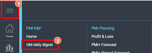
How to access the screen?
The GM daily digest is the first screen a general manager of a property will see when they first log-in to PMI. All other PMI users for a property can access to view the GM daily digest through the menu.
Yesterday’s result
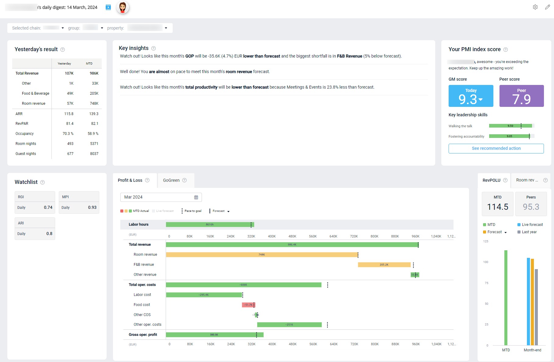
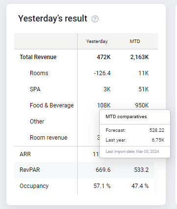
The results table shows what happened yesterday at the property, as well as MTD figures. Hover over the data to compare to Forecast and Last year. The data is taken directly from the Management perspective. Click on the table to view more details in the Management perspective.
Key insights
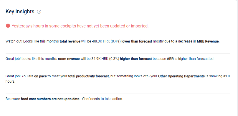
This section offers comments on how you are pacing to reach month end goals, and suggestions for what areas may need additional focus. For a closer look at the situation, click on the insight to review the relevant page in PMI.
The insights compare the month-end forecast with the Live forecast to highlight if you are on track to do better or worse than the forecast for the month. They also highlight if any data is missing or not updated.
Insights are shown for:
- GOP: Displays the difference between the month end GOP Forecast and the GOP Live forecast. It also highlights areas that have had a significant impact on the result.
- The data is taken from the waterfall chart below.
- Available for properties with PMI Planning.
- Total revenue: Displays the difference between the total revenue month-end forecast and the Live forecast. It also highlights areas that have had a significant impact on the result.
- The data is taken from the waterfall chart below.
- Available for properties without PMI Planning.
- Room revenue: Displays the difference between the room revenue month end forecast and the room revenue Live forecast. It also highlights whether Occupancy or ARR has the greatest impact on the result.
- The data is taken from the waterfall chart below, and the Management perspective.
- Productivity: Compares the total productivity forecast (sum of all department’s forecasts), compared with the Live forecast. It also highlights if any departments have not yet input hours for the month.
- The data is taken from the Management perspective.
- Food cost: Compares the food cost forecast to the Live forecast.
- The data comes from the Food cost cockpit (also visible in the Management perspective). If it is not yet updated for the month, this will be highlighted in the cockpit.
The red notifications inform you that yesterday’s hours have not yet been updated. Click on the alert to go to the homepage and view which cockpits need to be updated. (Cockpits that need to be updated have tiles with a yellow question mark in the corner.)
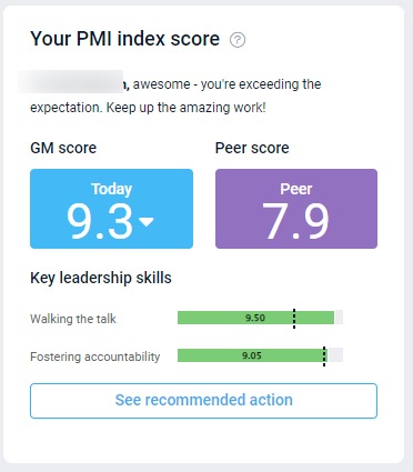
GM (personal Adoption index) score
The personal Adoption index on the GM Daily Digest provides insights into how effectively the GM is using PMI to manage their teams. The GM Index score serves as a key performance indicator, with a target score of 8/10. This score is derived from two critical leadership skills:
1. Walking the Talk
This measures how consistently the GM uses PMI to monitor performance and direct their teams.
- The goal is to use PMI at least 4 days a week.
- To achieve a perfect score of 10/10, PMI should be used 5 out of the past 7 days.
2. Fostering Accountability
This score is based on the property index, which averages departmental performance. This shows how well the GM has been able to motivate their teams to adopt PMI best practices.
- A high score suggests that resource management and productivity best practices are well adopted across teams, resulting in higher guest satisfaction, reduced waste, and a stronger bottom line.
PMI GoGreen Activation
If PMI GoGreen is activated, the fostering accountability score includes both the PMI GoGreen Index and the PMI Adoption Index, each contributing 50%. This comprehensive approach helps you assess and improve your leadership skills and overall property management through PMI.
Peer Score
The Peer Score represents the average GM score within the chain, allowing you to benchmark your performance against your peers.
View selector
The bottom half of the screen gives a month view, highlighting how you are doing compared to month-end goals covering both hours, revenue, and costs.
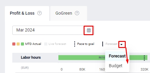
You can choose to compare your MTD data to either your forecast (goal) or budget, and choose the month to view. These changes affect all elements on this part of the screen.
Waterfall chart – Profit & loss (tab)
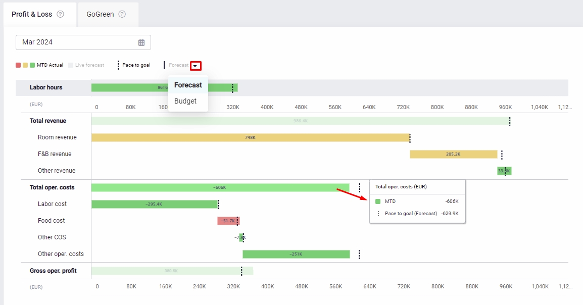
The Waterfall Chart in the GM daily digest provides a detailed visual breakdown of your property’s profit & loss performance across key metrics. This tool is essential for understanding how individual components, such as labor hours, revenue sources, and operating costs, contribute to your overall financial results.
Key Components:
Labor Hours: Located at the top of the chart, this section shows the total hours worked and compares them against forecasted hours. Despite its position, it uses the same x-axis measurement as the financial metrics below, ensuring consistency.
Total Revenue: Divided into:
- Room Revenue
- Food & Beverage (F&B) Revenue
- Other Revenue
These categories allow you to track each revenue stream against your forecast and actual results.
Total Operating Costs: Broken down into:
- Labor Costs
- Food Costs
- Other Costs of Sales (COS)
- Other Operating Costs
- Gross Operating Profit (GOP): This is your total revenue minus operating costs, showing a clear picture of your property’s profit.
Interactive Features:
- Click the legend to hide or display specific data on the graph.
- Hover over any bar for detailed insights into the underlying figures.
Bar Details:
- Gray Bar: Represents the month-end expectation or Live Forecast.
- Black Lines: Show your selected monthly goal, which could be either the budget or last approved forecast.
- Dotted Line: Indicates the pace required to meet your month-end goal, based on the Live Forecast.
Colored Bars:
- Red: Indicates you are off pace and behind target.
- Amber: Suggests you are close to pace (within 5% of the goal).
- Green: Shows you are on track or exceeding your goal.
Unique X-Axis Layout:
One notable feature of this chart is that the x-axis spans both the top and bottom. The Labor Hours section, at the top of the chart, shares the same horizontal scale as the financial metrics below. This allows you to directly compare labor hours with revenue and costs on the same measurement axis, giving you a comprehensive view of how time invested in labor translates into financial outcomes.
Unsure about the revenue?
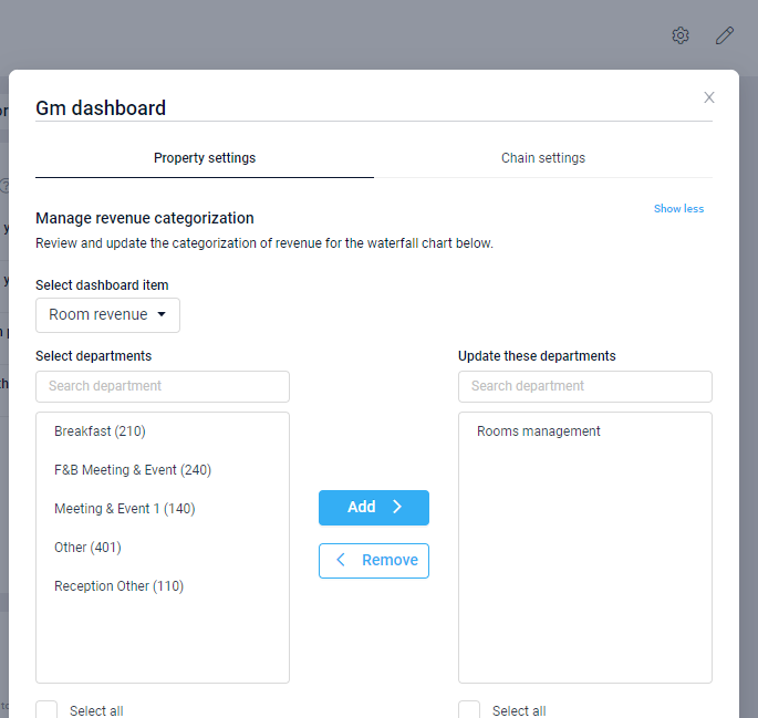
If you’re unsure about what revenue is included in each line or suspect some revenue might be missing, click the settings icon in the top right corner. This will allow you to review and adjust the revenue sources displayed in each line of the waterfall chart.
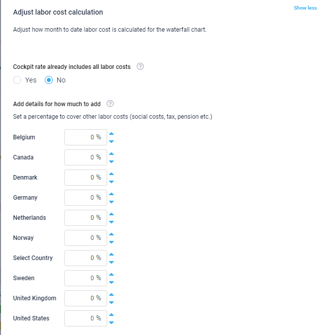
You can also adjust the labor cost calculation in the waterfall chart by going to settings. Use this if the hourly rates in the cockpits only includу an hourly rate. This is set at chain level, with the option to override at property level if needed.
For more details on the waterfall chart, including an explanation of all data sources for each line of the chart, view the article Waterfall chart explained.
Room revenue KPIs
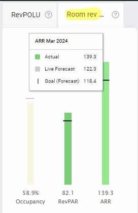
These 3 bars show occupancy, revenue per available room, and average room rate. The legend follows the same principles as the waterfall chart. The data source is the Management perspective.
RevPOLU
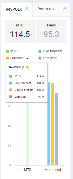
The RevPOLU (Revenue per Operational Labor Unit) metric measures your current performance against forecasted or budgeted expectations.
The Peers figure reflects the average RevPOLU for properties within your country that are part of the same chain. If there are no other properties in your country, it defaults to the chain-wide average across all properties.
The bar chart visually compares key performance metrics:
- MTD: Your current month-to-date performance.
- Forecast: The expected performance based on projections.
- Live Forecast: A real-time forecast that updates with the latest data.
- Last Year: Performance during the same period in the previous year.
Rev-GOP conversion
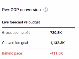
This is a calculation highlighting how much revenue you expect to flow through to your GOP when there is a variance from forecast. The target settings can be viewed and adjusted from the settings icon in the top right corner of the screen. This is only available if it has been activated by a chain.
For more details and a full explanation of the conversion calculation view the article Rev-GOP conversion explained.
Waterfall chart – GoGreen KPIs (tab)
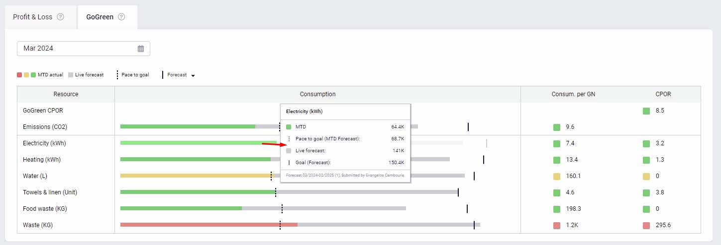
This section gives an overview of the most important environmental KPIs when PMI GoGreen is activated.
The KPIs per resource are measured per guest night (GN).
CPOR = (Unit price forecasted X with actual consumption MTD)/Room Nights.
GoGreen CPOR is the combined cost of the GoGreen KPIs per occupied room sold.
The performance is measured compared to the target MTD.
- On pace (green): below or within the month-end consumption target by 1%.
- Near pace (amber): above month-end consumption target by 1.01% – 10%.
- Behind pace (red): above month-end target by 10.01% or more.
Watchlist
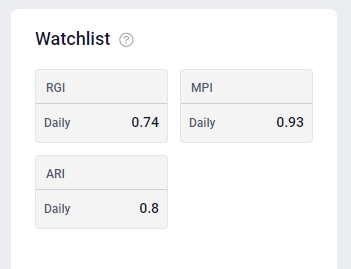
“Watchlist” lists four market index KPIs if available. This section allows for chain-specific KPIs to be shown to help highlight important metrics for GMs to track. These KPIs are:
- Ranking: This metric typically refers to how a property ranks in comparison to its competitive set or market. It helps general managers understand their position relative to competitors.
- RGI (Revenue Generation Index): The Revenue Generation Index measures a property’s share of revenue in relation to its fair share of the market. An RGI greater than 1 indicates that the property is capturing more than its fair share of revenue, while an RGI less than 1 suggests it is capturing less.
- MPI (Market Penetration Index): The Market Penetration Index evaluates a property’s occupancy performance relative to its competitive set. An MPI greater than 1 means the property is achieving a higher occupancy rate than its competitors, while an MPI less than 1 indicates a lower occupancy rate.
- ARI (Average Rate Index): The Average Rate Index compares a property’s average daily rate (ADR) to that of its competitive set. An ARI greater than 1 suggests the property is achieving a higher ADR than its competitors, whereas an ARI less than 1 indicates a lower ADR. These metrics are crucial for general managers to track and analyze their property’s performance in the market, helping them make informed strategic decisions.

