GoGreen Learning page overview
Navigating the GoGreen Learning Page
The GoGreen Learning Page helps you analyze historical performance and consumption behavior over time. It is designed for deeper insight and reflection, offering visualizations to guide decision-making and identify opportunities for improvement.
Here’s how to navigate the key elements:
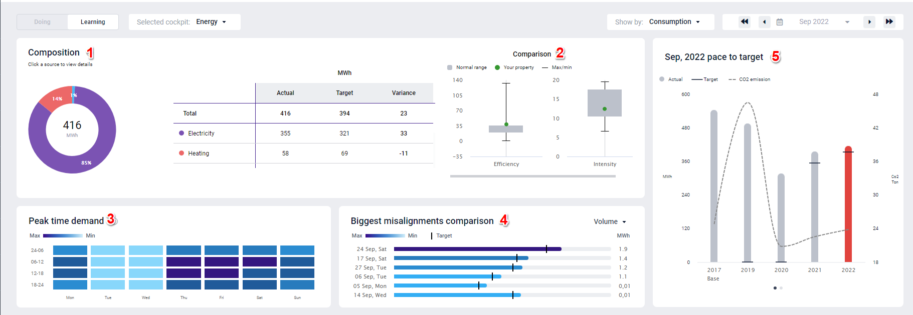
- Composition: A doughnut chart that shows the total consumption broken down by resource (e.g., electricity, heating). Click any section to filter the entire view based on that resource. A data table on the right displays actuals, targets, and variance for each category.
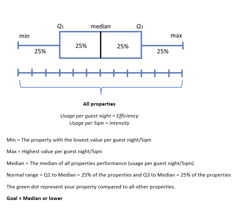
- Comparison: Boxplots comparing your property’s efficiency and intensity with those of peer properties. Use this to see how far your values deviate from the norm and where there’s room for improvement.
- Peak Time Demand: A heatmap showing average hourly consumption by day. This helps you pinpoint when your highest usage occurs and strategize around reducing or shifting that demand.
- Biggest Misalignments: A bar graph identifying days with the highest deviation from the target. You can toggle between views for efficiency, intensity, and volume to see where action may be most needed.
- Pace to Target: A bar chart tracking your actual vs. target usage across time. Includes CO2 emission impact. This widget helps determine whether you’re on track to meet sustainability goals and what areas need attention.
Each visual is interactive and offers insights that directly feed into the GoGreen Cockpit’s “Doing” view. Use the Learning Page monthly to assess performance trends, analyze root causes of deviations, and decide on preventative or corrective actions.
What is the purpose of GoGreen learning page?
GoGreen learning is an analysis tool which highlights how effective you have been in environmental and sustainability management. You can review resource consumption compared to previous periods and learn more about its composition and associated environmental impact as measured by Co2 and waste sorting rate.
Use this to evaluate if you are on track to meet the set sustainability targets and consider actions to be implemented to improve results. You can also evaluate patterns pertaining to peak time demands and identify major misalignments to identify short- and long-term actions to continuously minimize waste and cost.
As a PMI best practice, users should review the Learning Page linked from each GoGreen Cockpit monthly to evaluate the previous month’s results and identify potential actions moving forward.
As you review the page, consider the following questions:
- Which category (resource) is causing me not to reach my goal?
- Which day in the month is causing me not to reach my goal?
- How is my performance on the YOY(year on year) improvement compared to my peers?
- What kind of action should I take, corrective or preventative actions?
- In which period and activities does the variance occur when not reaching the YE (year end) goal?
What information is shown on the page?
The page can be accessed via the relevant resource cockpit. In the top left corner, select ‘Learning’
Select a cockpit, the data to be viewed (either consumption, cost or CO2) and the month to view.
1. Composition: the donut shows the breakdown of total consumption in the various categories (resources).
- Click a section to review. This selection will affect all the graphs on the screen.
- In the data table (to the right of the doughnut), categories displayed are the resources from the cockpit and the amount for the selected period (Actual), and the last submitted forecast (Target).
- Review the variance (usually in bold) from Target and consider the reasons for any large deviations. Take not of any actions to be taken.
- Consumption = Mwh
- CO2 = Ton
- Cost = Currency (it will display your local currency)
2. Comparison: The boxplot graph displays how your property’s consumption compares to peers.
- The normal range displays what is considered ‘acceptable consumption’ compared to properties in your group or hotel chain.
- Max is the property with the highest value in the chain and Min the lowest value in the chain.
- The properties you are compared with are all the properties in the country of your chain. The center of the normal range is the median usage of all properties. The goal is always to be lower than the median.
3. Peak time demand shows the average hourly consumption as a heat map
- Use this to evaluate at what times you are consuming the most and consider ways to reduce consumption where possible.
- The demand is shown throughout the day in 4-time slots, from Monday to Sunday. The calculation is based on the highest consumption (Max) to the lowest consumption (Min). The default date is the first 7 days in the selected period.
- The heat map shows hourly figures and the average sum of the period selected per hour
Highest value to 10% lower = Deep dark blue color
10.01 % to 20% lower = Dark blue color
20.01 to 30% lower = Blue color
30.01% to 40% lower = Light blue color
40.01% to 50% = very light blue color
50.01% and lower = Soft white color
- For peak demand times consider the following questions: Which day(s) in the week should I take corrective actions? What causes these peaks? What can I do/stop doing, or do more of to lower the peak or shift the timing to off peak?
4. Biggest misalignments comparison graph displays the days in the selected period with the most significant deviations from target. It shows the top 6 days with the highest discrepancy between actual and target in the selected period. The graph (bars) shows the highest to the lowest. Highest value and until 10% lower = Deep dark blue color. Use the drop-down list to choose between Efficiency, Intensity or Volume.
10.01 % to 20% lower = Dark blue color
20.01 to 30% lower = Blue color
30.01% to 40% lower = Light blue color
40.01% to 50% = very light blue color
50.01% and lower = Soft white color
- Volume = Total usage/consumption
- Efficiency = per GN
- Intensity = per Sqm
5. Pace to target graph displays the actual consumption for the period selected compared to the target and all historical months. This allows you to evaluate the pace to reach year-end goal. This determines the sense of urgency for the subsequent steps and how aggressive you must be in identifying improvement actions. When the current year in the widget “YoY pace to goal” is above target, the “YTD consumption composition” displays the source that are causing the “YoY pace to goal” being above target. Click on the dots below to change between pace to target and year-end pace to target view. Deviation raises question, here are a few examples: Are you on pace to reach your year-end goals? If not, what is the main cause? What can I start/stop doing and do more of to achieve this?
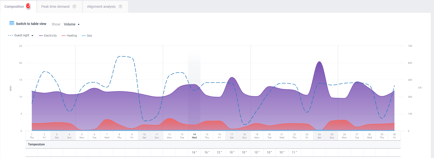
- Switch to table view for if so preferred
7. Peak time demand data table gives a complete overview for the selected period chosen. By clicking on the tab, it gives you an in depth look at #2. Efficiency presents the performance per GN (guest night) for the selected period. 100% is the best performance = highest efficiency per GN. Intensity presents the performance per Sqm of the selected period. 100% is the best performance = lowest intensity per Sqm.
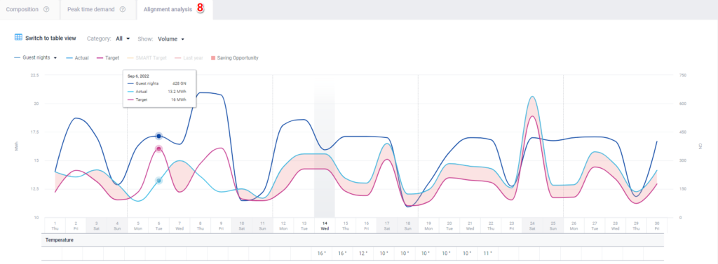
8. Alignment analysis graph represents the actual amount compared to the Target. Saving opportunities are the difference between Actual and Target values. It allows you to evaluate consumption alignment over time against selected KPIs (per GN, per RN and per Sqm). Deviation raises questions, here are a few examples: Is this consumption efficiency trending as planned? If not, what is the cause for this? What can I start/stop doing and do more of to reduce the resource consumption, especially the critical ones?
To summarise, GoGreen learning is an analysis tool which highlights how effective you have been in environmental and sustainability management. Use it to review resource consumption and evaluate if you are on track to meet your set sustainability targets. Review the GoGreen learning page for each resource once a month to evaluate the past month’s results and consider actions to implement going forward so that you can meet your targets.
Video
-
Getting started
-
-
- Arrivals/Departures
- Data elements required from PMS
- Manual Export PMS – Fidelio
- How to do a manual PMS export from Opera
- Manual Export PMS – Picasso
- Manual Export PMS – Protel
- Manual Export PMS – Spirit Web
- PMS – Cenium
- PMS – Citybreak
- PMS – Fidelio
- PMS – Opera
- PMS – Protel
- How to do a manual PMS export from HotSoft
- PMS – Skidata
- How to set up an Opera reports export
- PMI API
- PMI API Best Practice Get Forecasted hours
- PMI File Agent setup and documentation
- Technical specification for data integration
- How to transfer data to PMI
- How to enable Opera Cloud reports
- PMI system integration overview
- Import status overview
- Handling Outstanding Imports (Missing Data) in PMI
- How to read the import status page
- Opera Scheduler setup - Reservation Statistics 1
- Opera Scheduler setup - Report Trial Balance (trial_balance)
- Opera Scheduler setup - Reservation Forecast, (res_forecast)
- Opera Scheduler setup - Reservation History & Forecast (history_forecast)
- Opera Scheduler setup - Daily Forecast Report
- Opera Scheduler setup - SFTP transfer guide
- Manual Export PMS Opera
- Report 1 (manual export): Reservation Statistics 1 (res_statistics1)
- Report 2 (manual export): Reservation Forecast, (res_forecast)
- Report 3 (manual export): Trial Balance (trial_balance)
- Report 4 (manual export): Reservation History & Forecast (history_forecast)
- Show all articles ( 7 ) Collapse Articles
-
- Understanding Productivity in Hospitality (and Why It Matters in PMI)
- How Forecasting Drives Productivity in Hotels
- The Most Important Productivity KPIs in Hospitality
- The Hotel Productivity Management Cycle
- Hospitality Productivity and PMI – Quick overview
- Balancing Productivity, Cost Control, and Guest Service in Hotels
-
Video tutorials
-
- Administration Labor cockpit [14:49]
- Bar and Pub Labor cockpit [12:21]
- Breakfast Labor cockpit [12:05]
- Consolidated view in Benchmarking and Management Perspective [3:20]
- Flash Report Onboarding [6:27]
- Flash report overview [2:25]
- Food cost cockpit [6:21]
- Kitchen Labor cockpit [11:28]
- Labor Cockpit Onboarding [18:16]
- Labor cockpit overview [3:12]
- Live forecast 1/5 navigation [5:05]
- Live Forecast 2/5 Rooms [5:05]
- Live forecast 3/5 meeting & event [5:40]
- Live forecast 4/5 food & beverage [6:11]
- Live forecast 5/5 breakfast [7:19]
- Live forecast onboarding [6:06]
- Live forecast overview [2:58]
- Management perspective overview [3:06]
- P&L Planning 1/10 Purpose and benefits [2:25]
- P&L Planning 10/10 How to approve forecast and budget or target [2:34]
- P&L Planning 2/10 Navigation [4:26]
- P&L Planning 3/10 How to build a total [4:29]
- P&L Planning 4/10 Three ways of inserting figures [4:32]
- P&L Planning 5/10 How to add a sub account [1:42]
- P&L Planning 6/10 How to build a constant [2:42]
- P&L Planning 7/10 Staff module [2:48]
- P&L Planning 8/10 How to add a staff member [1:33]
- P&L Planning 9/10 How to revise and submit a forecast [3:01]
- Repair and Maintenance Labor cockpit [13:01]
- Restaurant Labor cockpit [12:30]
- Schedule 1/8 Navigation [5:12]
- Schedule 2/8 How to create a labor cockpit schedule [4:29]
- Schedule 3/8 How to add a team member [2:07]
- Schedule 4/8 How to create a shift code [3:30]
- Schedule 5/8 How to add shift codes to team members [3:41]
- Schedule 6/8 How to create a rotating schedule [3:20]
- Schedule 7/8 How to replace shift codes for a period [2:00]
- Schedule 8/8 How to create split shifts between departments [2:42]
- Stewarding Labor cockpit [11:38]
- Timesheet Onboarding [4:14]
- Show all articles ( 25 ) Collapse Articles
-
- Articles coming soon
-
- Administration Labor cockpit [14:49]
- Bar and Pub Labor cockpit [12:21]
- Breakfast Labor cockpit [12:05]
- Food cost cockpit [6:21]
- Front office Labor cockpit [12:05]
- Housekeeping Labor cockpit [11:20]
- Kitchen Labor cockpit [11:28]
- Labor Cockpit Onboarding [18:16]
- Labor cockpit overview [3:12]
- Repair and Maintenance Labor cockpit [13:01]
- Restaurant Labor cockpit [12:30]
- Schedule 1/8 Navigation [5:12]
- Schedule 2/8 How to create a labor cockpit schedule [4:29]
- Schedule 3/8 How to add a team member [2:07]
- Schedule 4/8 How to create a shift code [3:30]
- Schedule 5/8 How to add shift codes to team members [3:41]
- Schedule 6/8 How to create a rotating schedule [3:20]
- Schedule 7/8 How to replace shift codes for a period [2:00]
- Schedule 8/8 How to create split shifts between departments [2:42]
- Stewarding Labor cockpit [11:38]
- Timesheet Onboarding [4:14]
- Show all articles ( 6 ) Collapse Articles
-
- How to edit a plan [3:52]
- P&L Planning 1/10 Purpose and benefits [2:25]
- P&L Planning 10/10 How to approve forecast and budget or target [2:34]
- P&L Planning 2/10 Navigation [4:26]
- P&L Planning 3/10 How to build a total [4:29]
- P&L Planning 4/10 Three ways of inserting figures [4:32]
- P&L Planning 5/10 How to add a sub account [1:42]
- P&L Planning 6/10 How to build a constant [2:42]
- P&L Planning 7/10 Staff module [2:48]
- P&L Planning 8/10 How to add a staff member [1:33]
- P&L Planning 9/10 How to revise and submit a forecast [3:01]
-
- Articles coming soon
-
-
Onboarding
-
- Onboarding roles overview
- Onboarding roles – Breakfast
- Onboarding roles – Finance
- Onboarding roles – Food cost
- Onboarding roles – Front Office
- Onboarding roles – Housekeeping
- Onboarding roles – Kitchen
- Onboarding roles – Restaurant and Meeting & Event
- Onboarding roles – Stewarding
- Onboarding roles – Repair and Maintenance
- GM Introduction to PMI
- Onboarding roles – Bar and Pub
- Onboarding roles – Administration
-
-
GM's corner
-
PMI homepage
-
PMI planning
-
- How to work with Rooms Budget and forecast
- How to work with non-rooms Budget and forecast
- Use Forecast/Budget hours from Cockpit in P&L Staff module
- How to input a budget in PMI
- Setting productivity targets in PMI
- Express planner overview
- How to run Express planner
- How to configure Express planner settings
- Express planner calculation explanation with examples
- Compiling revenue streams overview
- How to manually enter a revenue budget in PMI
- How to enter a revenue budget in PMI using Live forecast data
- How to enter a revenue budget in PMI using the Data Upload Centre
- How to set monthly labor productivity and hour targets in PMI
- Arrivals, departures, and stay over visibility
-
- Accounts overview
- How to populate and edit accounts
- How to approve a forecast or budget in PMI
- How to copy from reference
- How to edit and update using the staffing tool
- How to make a profit forecast
- How to set up a weekly Live forecast
- How to add a comparison year in P&L
- How to modify a P&L report
- Planning Menu – Tools and View Options overview
- Planning staff module overview
- How to build a P&L planning report
- How to add staff and manage staff cost
- Staffing screen overview
- How to input a budget in PMI
- PMI Planning module overview
- How to add a Food & beverage revenue forecast in P&L Planning
- How to add room revenue in Planning
- Constants explained: how they work in PMI Planning
- Auto-populate P&L Staff hours and rates from Budget & forecast
- Show all articles ( 5 ) Collapse Articles
-
-
Cockpit
-
- Labor cockpit overview
- Labor Cockpit Preparations
- Labor cockpit cost driver
- SMART forecast explained
- How does SMART allocate daily hours?
- Using arrivals and departures as a cost driver
- Closing Profit Center or Cockpit
- How to work with labor cost
- Min/Max explanation
- Parent and sub-cockpits explained
- Staffing guide explained
- Daily and weekly routines for department heads
- Understanding the importance of including outsourced labor hours in PMI
- How to add labor cost in PMI
- Cockpit rates - Daily weighted payroll projection
-
- Labor cockpit schedule
- How to make a schedule
- How to revise a schedule
- PMI Schedule: Information and Calculation rows explained
- Predefined shift codes
- How to print a schedule
- Revise staff
- Schedule 1/8 Navigation [5:12]
- Schedule 2/8 How to create a labor cockpit schedule [4:29]
- Schedule 3/8 How to add a team member [2:07]
- Schedule 4/8 How to create a shift code [3:30]
- Schedule 5/8 How to add shift codes to team members [3:41]
- Schedule 6/8 How to create a rotating schedule [3:20]
- Schedule 7/8 How to replace shift codes for a period [2:00]
- Schedule 8/8 How to create split shifts between departments [2:42]
- How to work with the Schedule in PMI
- Split Shifts Between Departments
- The Schedule Tools & View menu options overview
- Show all articles ( 3 ) Collapse Articles
-
-
Live forecast
- Live forecast overview
- How to set up a Live forecast: configuration settings
- Live forecast tools and personal view settings
- PMI prediction explained
- Pickup explanation
- Revenue driver explained
- Segment OTB
- Submit Live Forecast to Forecast (monthly routine)
- NextGen Rooms Live forecast overview
- NextGen Rooms Live forecast: Weekly routine overview
- Rooms live forecast: How to work with auto Live forecast
- NextGen Rooms live forecast: Personal view options
- Rooms Live forecast: Sense check mode explained
- How pickup fields are displayed and used in Room live forecast
- Collaborative Forecasting with PMI Prediction
- Non-rooms Live forecast using PMI prediction
- Live forecast – Copy to live forecast
- Live forecast – Revise forecast/budget
- Rooms Live forecast - Edit guest nights factor explained
- Show all articles ( 4 ) Collapse Articles
-
Data analysis views
-
Administration
-
- Add documents to a property
- Currency settings
- Fact sheets overview
- Group external hotel
- How to use hours transfer [3:34]
- Hours transfer rules
- Operational status
- Period locking overview
- Share group
- Share hotel
- How to complete Classification Fact sheet
- How to use Period locking for R&P in practice
- How to manage GoGreen Period locking
-
-
GoGreen
-
- Comparative data explained
- Data table general explained
- Formula/Calculations explained
- Goal charts and YoY comparison explained
- How to edit a GoGreen plan
- How to set up a Plan
- Intro to NextGen GoGreen Planning
- Main chart explained
- Plan values explained
- Save changes button explained
- Sense check mode explained
- Unit price explained
- Volume/usage/consumption explained
- How to do a monthly forecast routine in NextGen Planning
- GoGreen home page overview
- GoGreen Doing Cockpit overview
- GoGreen Learning page overview
- GoGreen index overview
- Weather normalization overview
- CO2 factors overview
- GoGreen targets explanation
- GoGreen index: How are the measurements calculated?
- Useful links for sustainability and environmental management best practice
- How to make a manual entry in a GoGreen cockpit
- Weather normalization explained
- GoGreen benchmarking enhancement - 01.23
- GoGreen – Data Integration & Insights (Overview)
- Environmental Sustainability in Hotels – Foundation
- Environmental Dimensions in Hotel Operations (Energy, Water, Waste, Emissions, etc.)
- Environmental Management Systems (EMS) in Hotels
- GoGreen Monitoring, Measurement, and Performance Evaluation in Hotels
- Waste Measurement and Verification in Hotels
- Emergency Preparedness and Environmental Risk Management in Hotels
- Hotel Water Consumption Profile & Key KPIs
- Domestic Hot Water Systems in Hotels (Efficiency & Legionella Control)
- Cooling Towers and Water Efficiency in Hotel HVAC Systems
- Water Metering, Submetering and Leak Detection in Hotels
- Preventive Water Management Tasks for Hotels
- Nordic Swan Ecolabel for Hotels
- How the Nordic Swan Criteria and Scoring Work
- BREEAM Certification for Hotels Explained
- Green Key Certification for Hotels
- Hotel Energy Consumption and Key Performance Indicators
- Hotel Energy Benchmarking (A++–G Classification)
- HVAC Systems and Energy Optimization in Hotels
- Boiler Systems and Heating Efficiency in Hotels
- Building Management Systems (BMS) and Energy Monitoring
- Preventive Energy Management and Engineering Tasks
- GoGreen Sustainability Knowledge Hub
- Advanced Water Optimization in Hotels
- Smart Leak Detection in Hotels
- Smartvatten Leak Alarms for Hotels
- How to Investigate Water Leaks in a Hotel
- Water Balance Modeling and Water Analytics for Hotels
- Smart Irrigation and Cooling Tower Water Optimization in Hotels
- Hotel Water Management and Optimization – Overview
- How to Control Linen Inventory in Hotels
- How to Set Up a Food Waste Management Program in Hotels
- How to Run a Food Waste Audit in Hotels
- Food Waste Troubleshooting and Best Practices for Hotels
- PMI Energy Heatmap – Understanding Energy Consumption Patterns
- How to Control Your Hotel Using Data and Operational Discipline
- PMI GoGreen Cockpit – Managing Sustainability Performance in Hotels
- How to Set Up GoGreen in PMI
- How to Measure and Manage Waste in Hotels
- GSTC Hotel Standard – What It Is and How It Applies to Hotels
- Green Key Certification for Hotels – What It Is and How It Works
- Sustainability Certifications for Hotels – GSTC, Green Key, Nordic Swan, and BREEAM
- GoGreen in PMI – Sustainability and Operational Efficiency in Hotels
- PMI GoGreen Knowledge Hub
- Show all articles ( 41 ) Collapse Articles
-
-
KPIs
-
PMI adoption index
-
General user knowledge
-
Miscellaneous
-
Access system
- Articles coming soon
-
FAQ
-
- How can I see the hours that are imported to PMI?
- How do I enter the rates?
- How do I know if I am scheduling according to activity?
- How does PMI summarize the hours?
- How is productivity calculated?
- What are fixed hours?
- What are productive and non-productive hours?
- What are the rates and how are they calculated?
- What is a cost driver?
- What is min/max hours?
- Why do the planned hours in the Timekeeping System (TKS) not match PMI?
- Why is the total number of hours for the month too low/high?
- What is SMART?
- How F&B departments can set realistic targets when room revenue drops temporarily
-
- How do I estimate my Closing Inventory?
- My food cost % is wrong (too high/low). Why is that?
- My turnover days are set to 32. What does that mean?
- What are my routines in the Food cost cockpit?
- What do I enter in the Purchase column?
- What is opening and closing stock?
- What is the recommended number of turnover days?
- What is turnover days and how is it calculated?
- Where do I change my food cost forecast?
- Why is opening and closing stock important?
-
- Can one employee work in two departments?
- How do I add a shift code?
- How do I copy hours into the unspecified row (Timekeeping system excluded)
- How do I create a rotating schedule?
- How do I make a new schedule?
- How do I navigate the tools in the schedule?
- What are timekeeping system (TKS) excluded hours for?
- How do I add a schedule to my cockpit?
- Do workers added in the schedule get carried over to future months?
-
- Do I have to change my budget & forecast manually every month?
- How can I see what the current cost driver is?
- How do I set a productivity goal?
- How does the cost driver effect my hours and productivity?
- Where can I find the upload function?
- Why are my budget and forecast locked?
- What is Room revenue planning?
-
- How do I copy to Live forecast?
- How do I submit my Live forecast to forecast?
- How do I reset the pickup for a full month?
- Why do I have a red triangle to the left of the date?
- What are Pickup statistics?
- What are covers?
- What are the seasons in PMI?
- What do the pickups show and why are they sometimes negative?
- What is a revenue driver?
- What is the difference between Forecast and Live forecast?
- Why does on the books in PMI not match what we have in our PMS?
- How do I calculate ARR and ADR?
-
- Can I edit the figures in the Flash report?
- Different view options in the Flash report
- How am I performing compared to my forecast/budget/last year?
- How can I print the report?
- How can I switch between viewing daily and monthly figures?
- How do I check what segments add to the total daily figure?
- How do I edit my covers?
- Why are my room/guest nights wrong?
- What is the Flash Report
- Why is my revenue wrong?
- How is the month-to-date forecast and budget calculated in the Flash report?
- Why are the numbers in the Flash report different from the Live forecast?
- Where can I see account mapping details?
-
- How do I know if the mapping is correct?
- How do I know where accounts should go in PMI?
- How do I map the categories in the timekeeping system (TKS)?
- I cannot see my department in Timekeeping System (TKS) mapping. How do I see it?
- There is a position missing in the Timekeeping system mapping. How can I fix this?
- What are Categories in PMI Timekeeping system?
- What is Departments in Timekeeping system (TKS) mapping?
- What is mapping accounts?
- What is mapping – timekeeping system?
- Why don’t I see the spoon and fork icon in account mapping?
-
PMI Release notes
-
- GoGreen Task Bank and Cockpit enhancements - 12.24
- Refrigerants and Fuel Tracking for GoGreen cockpits enhancement - 11.24
- KPI targets enhancement - 10.24
- Automatic renewal of constants enhancement - 10.24
- GoGreen manual entry enhancement - 10.24
- CO2 factors enhancement - 09.24
- KPI targets enhancement - 07.24
- NextGen Rooms Live forecast statistics and pickup data enhancement - 07.24
- Date picker enhancement - 07.24
- Update to NextGen Rooms Live forecast - 06.24
- P&L planning accounts enhancement - 06.24
- Weather normalization enhancement - 05.24
- Update to NextGen Rooms Live forecast page: Sense check updates - 05.24
- PMI adoption index enhancement - 05.24
- PMI adoption index enhancements - April 2024
- Consolidation OTB enhancement - April 2024
- Update to NextGen Rooms live forecast page: Personal view options, Mar 2024
- User administration enhancements March 2024
- GM daily digest enhancement March 2024
- PMI Index calculation updates for 2024
- KPI targets enhancement February 2024
- KPI targets enhancement - January 2024
- Show all articles ( 7 ) Collapse Articles
-
- GoGreen benchmarking enhancement - 01.23
- GoGreen index calculation enhancement - 04.23
- PMI adoption index: Help videos for measurements enhancement - 02.23
- Activity log enhancement - 07.23
- Arrivals and departures forecast enhancement - 02.23
- KPI upload tool enhancement - 08.23
- GoGreen Food waste cockpit enhancement - 08.23
- GoGreen Doing cockpit enhancement - 06.23
- Benchmarking: PMI Index value updates based on time period selected - 06.23
- GoGreen cockpit: Highlight months missing data on 12 month graph - 07.23
- KPI targets enhancement - 01.23
- Goal distribution tool enhancement - 09.23
- Live forecast enhancement: Editing ARR values -12.23
- User administration release note - 12.23
- New page view of Rooms live forecast - 12.23
-
- Benchmarking calculation enhancement - 03.22
- Enhancement to add department type in the P&L report - 03.22
- Print all unmapped accounts on chain level - 03.22
- Printing to Excel and PDF enhancement - 03.22
- Introduction to PMI enhancement
- Room Live forecast – Change to pickup fields - 04.22
- Information/calculation rows in PMI schedule - 09.22
- Export to Google Sheets enhancement - 08.22
- PMI Advanced settings – Period locking - 06.22
- GM daily digest enhancements - 09.22
- PMI adoption index: Option to filter and export scores enhancement - 12.22
- Profit center Live forecast: Automatically switch between OTB and revenue driver
- SMART Forecast enhancement - 09.22
-
d2o team only
-
- Articles coming soon
-
- Articles coming soon
-
- Articles coming soon
-
- Articles coming soon
-
