PMI adoption index overview
What is the purpose of PMI adoption index?
PMI adoption index is designed to be a learning and development tool for department heads to help improve the skills and adopt best practices around productivity and resource management.
The main purpose of PMI adoption index is not focused on the productivity outcome but rather on how well you perform the individual tasks that make up productivity management in PMI. In our experience, mastering these tasks and skills, will automatically lead to better and more consistent productivity outcome.
What does PMI adoption index measure?
PMI adoption index measures your resource and productivity management skills on a department level. The score indicates how well your productivity management skills and habits are according to PMI best practices. A PMI index score of 8 out of 10 is good, with 8.5 or above considered great.
- It is an aggregated score based on the individual tasks that make up productivity management in PMI. Each task has a different impact (or weighting) on the total score depending on its importance.
- The property score is an accumulated score of all departments. Each department has a different weighting depending on the size of that specific department. Size is measured by revenue and hours worked in the last 7 weeks. A larger department will have a bigger impact on the total score.
- The score is recalculated every morning, so if you make changes in PMI be sure to check back the following day to see the affect on your score.
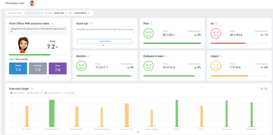
The first tile on the screen shows you the scores of the selected department or property:
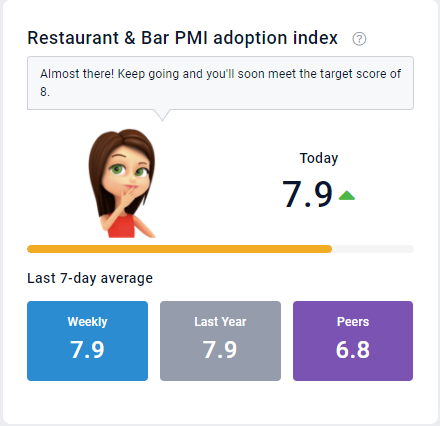
- Today – the most recent calculated Index score. The arrows indicates how your score compares to the previous day. Hover over the score to view when this was last updated. The score is specific to the department selected. If you select ‘All departments’ the score shows the total property score which is an accumulated score based on the individual department scores.
- Current – the average score from the last 7 days. This gives you a more consistent view of how you are doing.
- Last year – The ‘Current’ PMI score for the same period last year.
- Peers – The average ‘Current’ PMI score for the property’s in your peer group. Hover over the value to see exactly what are considered your peers.
How are productivity management skills measured?
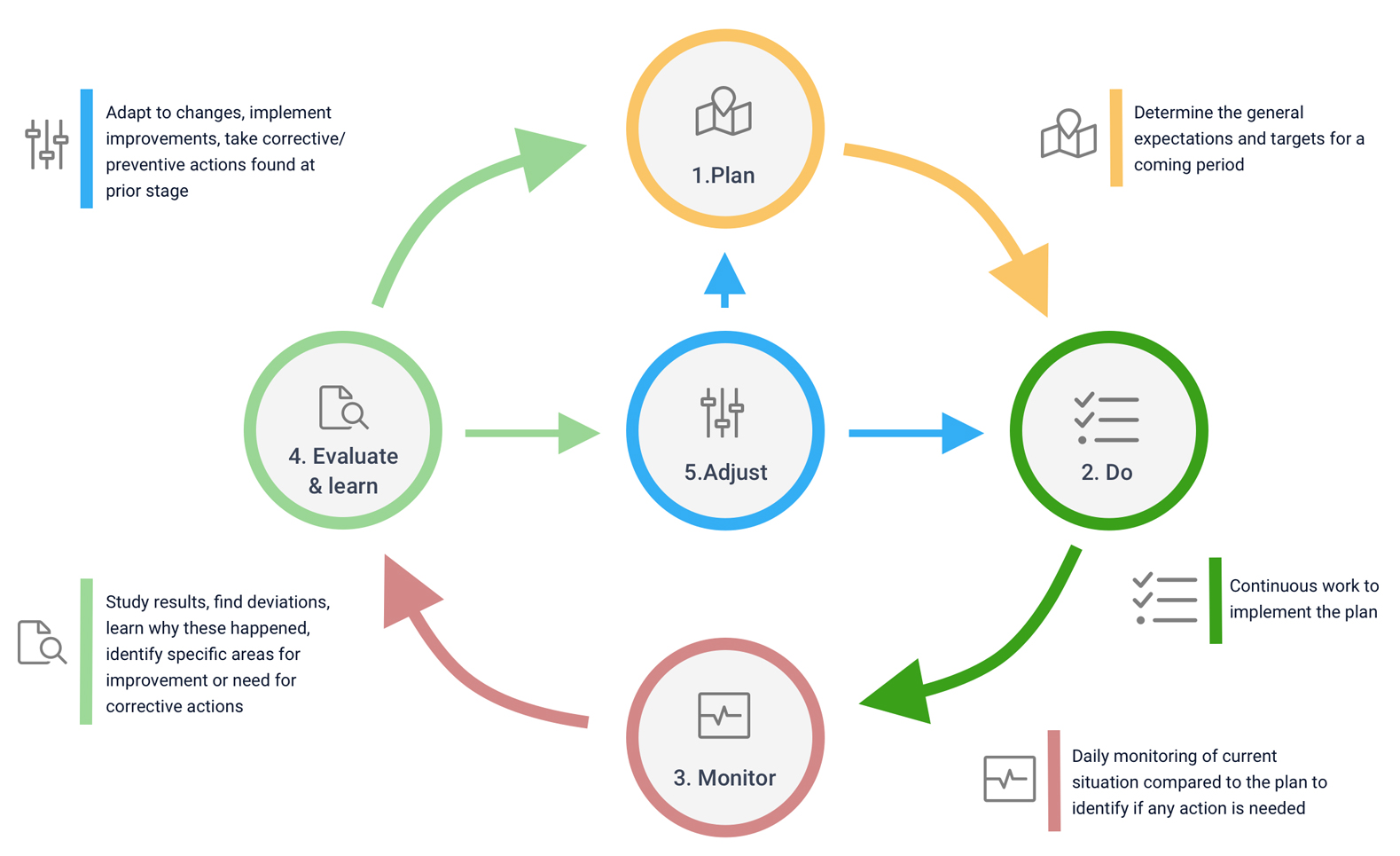
The individual tasks and skills being measured are organized according to Adaptive resource management (ARM) process framework which consists of 5 steps:
- Plan – Set yourself up for success with a clear plan. Create realistic forecasts and budgets for the coming periods.
- Do – Do you continuously work to implement the business plan underpinning the budget or forecast?
- Monitor – Do you know what’s going on? Are you regularly reviewing the current situation compared to the budget or forecast to identify additional actions needed?
- Evaluate & learn – Are you ready to learn and improve? Study results, find deviations, learn why things happened, identify specific areas for improvement and need for corrective actions.
- Adjust – Continuous improvement. Adapt to changes by implementing improvements and take corrective/preventive actions found at a prior stage to meet the target set.
Adaptive Resource Management Framework (ARM)
The main focus of ARM is continuous improvement to cope with uncertain environment.
More about the generic ARM framework here: https://en.wikipedia.org/wiki/Adaptive_management
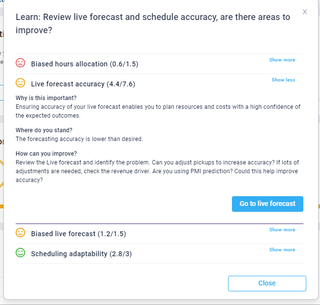
Within each of the steps, there are a number of measurements, or tasks, that make up that section. Each measurement has a different weighting depending on its significance. A higher weighted measurement will have a greater impact on your total score.
To view all the measurements included in a step, click on the relevant tile. Click ‘Show more’ for a full explanation on why this is important, how you are doing and what is needed to improve. Click the link to review the relevant place in PMI and adjust as needed. This feature is only available when viewing at a department level.
What do the points mean?
The points show you the breakdown of the total department score. The sum of the points of all the steps is equal to the adoption index score. For example, in the below image the sum of 22.1+20.1+11.3+10.7+7.7 is 72/100 which matches to Today’s index score of 7.2/10. Use these points to see what areas you need to focus on in order to improve your score.
You can also view the individual points per measurement when you click on the ARM tiles. Remember, more points = higher score.
When viewing the dashboard at a property level you can view the accumulative points earned for all departments. To see the breakdown per individual department, view the department’s dashboard.
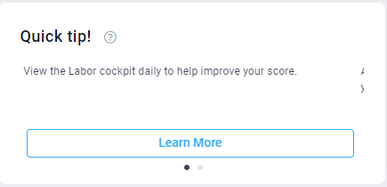
The quick tip tile highlights actions that can be taken today which will have the biggest impact on the index score. Select learn more for an explanation of the task required and click the link to view the page.
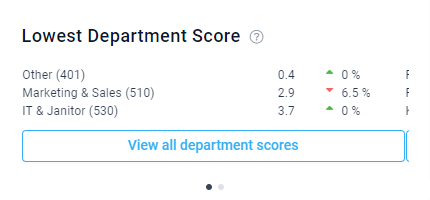
When viewing at property level, you will see here a list of all departments and their scores. These can be filtered by division, and sorted from lowest to highest, or from highest to lowest. Click on a department to view the department’s index dashboard.
What do the graphs show?
The Organization overview shows all departments in a property. The color and height of a bar indicate the index score. 0-5 is red, 5.1-7.9 amber and 8-10 green. The width of the bar indicates the weighting, or the impact on the overall score.
In cases where multiple units are of the same color, focus on improving the shortest one with the greatest width/weight, i.e. the one with the highest improvement potential.
Scroll arrows – use these to view additional bars on the graph if there are too many to view in a graph.
You can view the weightings by hovering over the bar charts in the Overview graph. The below example is a small property with 3 departments. Here we can see that restaurant is the widest bar, and therefore the highest impact. It’s weighting 64.9/100 meaning the restaurant score of 5.6 a higher proportionate impact than the other departments on the total score.
How is the weighting calculated?
- Cockpit only – the weight is calculated based on how many hours the department uses out of all hours used at the hotel. Examples of a labor cockpit are Front Office, Housekeeping, Public Area cleaning, Administration, Maintenance, Kitchen, and Stewarding.
- Profit Center only – the weight is calculated based on what revenue share of total revenue this profit center has. Examples of a profit center are Other.
- Combined cockpit and profit center – the weight is a mix of the two calculations above. Examples of a combined labor cockpit and profit center are Restaurant, Bar, Breakfast, and Meeting & Events.
PMI index trend graph
Select the dots below the graph to view the PMI index trend graph. This graph shows the dpearment or property’s adoption index score trend. Use this to look back and evaluate how your index score has been changing over time. Hover over the lines on the day or month you wish to view to see more details.
You can choose Monthly or Yearly view.
Monthly – displays the last 28 days, today and the coming 7 days. The score for each day is shown.
- Current – blue line – current score of the property you chose
- Previous year – gray line – last year score of the property you chose
- Peer average – purple line – peer average of the group the specific property belongs to
- Target – green line highlights the target score of 8/10
Yearly – displays the current month and the previous 11 months.
- Current – blue line – current score of the property you chose
- Previous year – gray line – the average monthly score last year of the property you chose
- Peer average – purple line – peer average of the group the specific property belongs to
- Target – green line highlights the target score of 8/10

